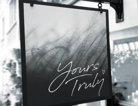
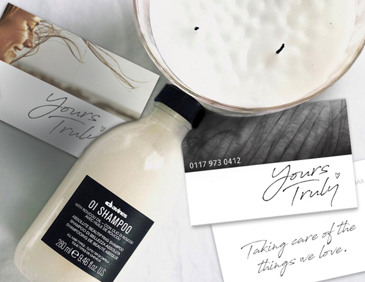
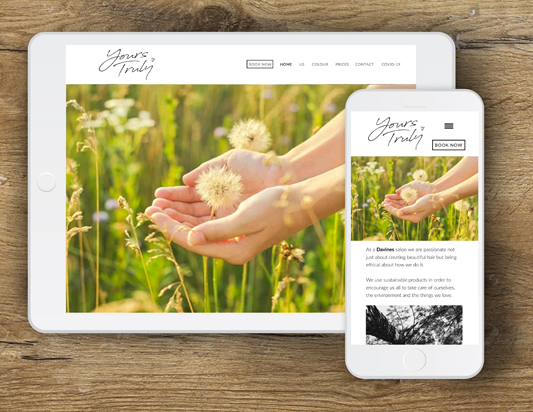


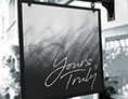
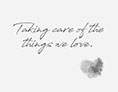


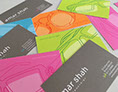


Adaptable branding for an independent hair salon. The salon uses Italian hair products which are eco friendly and use natural ingredients. The brand design reflects this ethos of sustainable beauty. The language used in the strapline 'Taking care of the things we love' captures the essence of the brand.
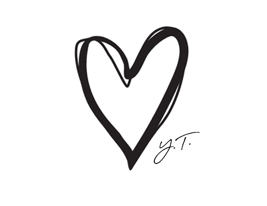
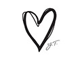
The signature style typography and hand drawn heart add a personal and friendly touch to the overall brand story. The monochrome colour palette keeps the brand simple and down to earth. The heart logo and brand style has been designed to work across social media.
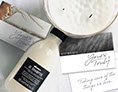
Adaptable branding for an independent hair salon. The salon uses Italian hair products which are eco friendly and use natural ingredients. The brand design reflects this ethos of sustainable beauty. The language used in the strapline 'Taking care of the things we love' captures the essence of the brand.
The signature style typography and hand drawn heart add a personal and friendly touch to the overall brand story. The monochrome colour palette keeps the brand simple and down to earth. The heart logo and brand style has been designed to work across social media.
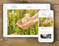
Adaptable branding for an independent hair salon. The salon uses Italian hair products which are eco friendly and use natural ingredients. The brand design reflects this ethos of sustainable beauty. The language used in the strapline 'Taking care of the things we love' captures the essence of the brand.
The signature style typography and hand drawn heart add a personal and friendly touch to the overall brand story. The monochrome colour palette keeps the brand simple and down to earth. The heart logo and brand style has been designed to work across social media.
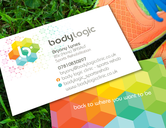
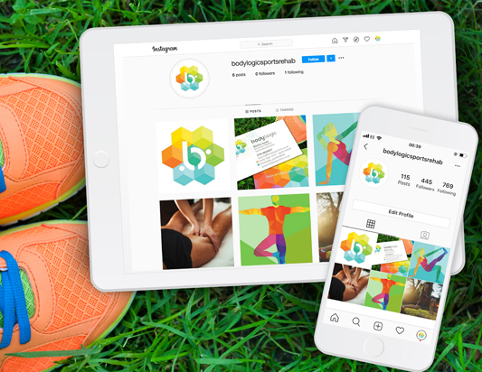
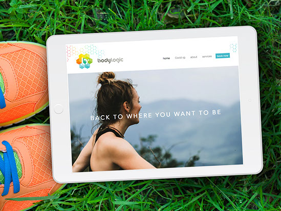
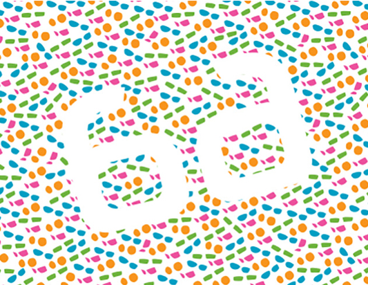
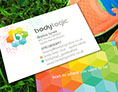
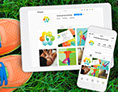
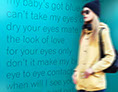
Science and Connectivity form the main theme for this Sports Physio brand.
Support imagery provides the human touch and the positioning statement 'back to where you want to be' promotes positive outcomes.
Science and Connectivity form the main theme for this Sports Physio brand.
Support imagery provides the human touch and the positioning statement 'back to where you want to be' promotes positive outcomes.
https://www.bodylogicclinic.co.uk
Science and Connectivity form the main theme for this Sports Physio brand.
Support imagery provides the human touch and the positioning statement 'back to where you want to be' promotes positive outcomes.
Science and Connectivity form the main theme for this Sports Physio brand.
Support imagery provides the human touch and the positioning statement 'back to where you want to be' promotes positive outcomes.
Science and Connectivity form the main theme for this Sports Physio brand.
Support imagery provides the human touch and the positioning statement 'back to where you want to be' promotes positive outcomes.
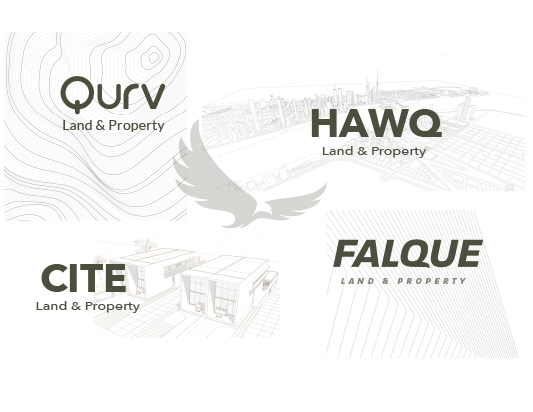
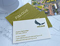
Creative Branding for a new start up business. My client has been working in the Development and Regeneration sector for over 20 years as a Chartered Surveyor and recently founded Falque Land and Property. I created the brand strategy, came up with the name, designed the branding, website and bespoke social media.
https://www.falquelandandproperty.co.uk/
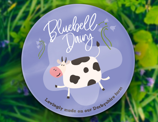
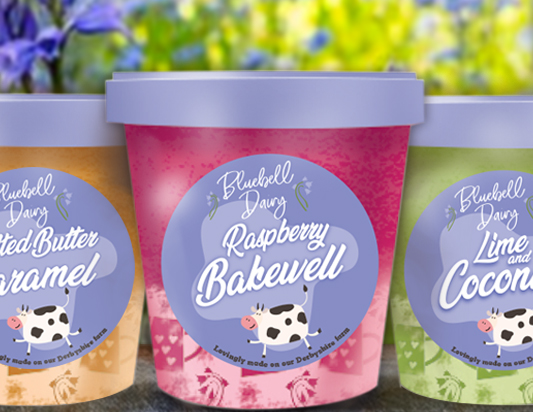
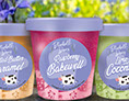
Oodles of personality for this artisan ice cream made in the same way as gelato but with a British twist.
The friendly graphics create a distinctive fun brand for this family run farm.
The farmhouse pottery illustration on the packs adds to the brand story and the words 'Lovingly made on our Derbyshire farm' gives the product real provenance.
Each of the delicious flavours has been given it's own scrummy colour making it easier for the consumer to choose... well in theory. Frankly I'd want to take them all home with me!
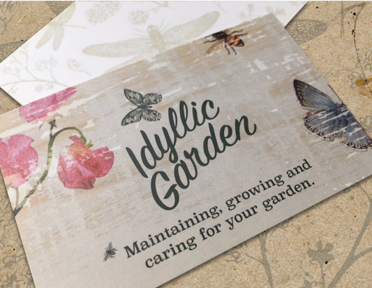
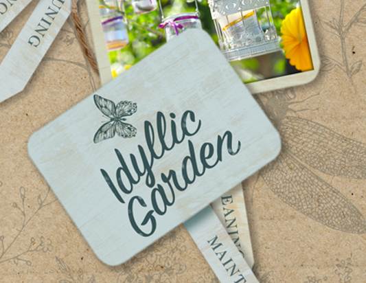
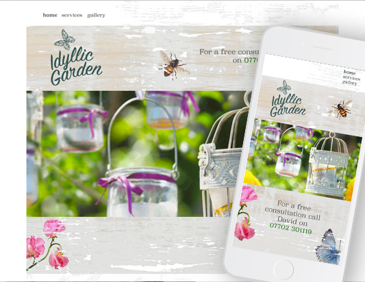
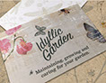
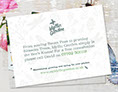
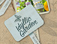
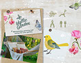
The brief was in the name! To create a brand that reflected our gardens as 'Peaceful Retreats'.
For his postcards my client didn't want the usual boring 'list of services' so I created a little poem...
'From sowing Sweet Peas to pruning
Blossom Trees, Idyllic Garden simply is
the Bee’s Knees!'
Along with the strapline 'Maintaining, growing and caring for your garden' we felt this better positioned him to stand out from his competitors.
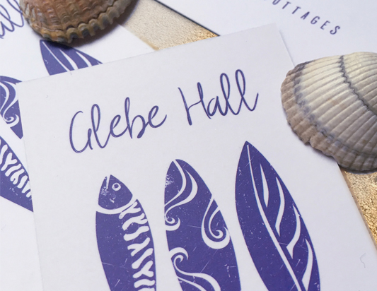
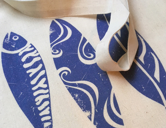
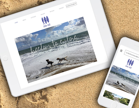
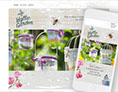
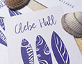
Glebe Hall Holiday Cottages are situated on the Lizard Peninsula in Cornwall. The area has lots to explore, not just the coast so the Logo reflects this. The three icons describe the varied holiday experience guests would have. The fish represents food/sea/river, the surf board, activity and the leaf reflects the flora/fauna of the landscape and beautiful gardens nearby. The distressed style logo creates an Artisan feel and the hand drawn font offers a personal touch. Cornish blue adds authenticity and the use of language ‘Freedom to explore' further reflects Glebe Hall as a perfect location for discovering the Lizard Peninsula.
Glebe Hall Holiday Cottages are situated on the Lizard Peninsula in Cornwall. The area has lots to explore, not just the coast so the Logo reflects this. The three icons describe the varied holiday experience guests would have. The fish represents food/sea/river, the surf board, activity and the leaf reflects the flora/fauna of the landscape and beautiful gardens nearby. The distressed style logo creates an Artisan feel and the hand drawn font offers a personal touch. Cornish blue adds authenticity and the use of language ‘Freedom to explore' further reflects Glebe Hall as a perfect location for discovering the Lizard Peninsula.
Glebe Hall Holiday Cottages are situated on the Lizard Peninsula in Cornwall. The area has lots to explore, not just the coast so the Logo reflects this. The three icons describe the varied holiday experience guests would have. The fish represents food/sea/river, the surf board, activity and the leaf reflects the flora/fauna of the landscape and beautiful gardens nearby. The distressed style logo creates an Artisan feel and the hand drawn font offers a personal touch. Cornish blue adds authenticity and the use of language ‘Freedom to explore' further reflects Glebe Hall as a perfect location for discovering the Lizard Peninsula.
Glebe Hall Holiday Cottages are situated on the Lizard Peninsula in Cornwall. The area has lots to explore, not just the coast so the Logo reflects this. The three icons describe the varied holiday experience guests would have. The fish represents food/sea/river, the surf board, activity and the leaf reflects the flora/fauna of the landscape and beautiful gardens nearby. The distressed style logo creates an Artisan feel and the hand drawn font offers a personal touch. Cornish blue adds authenticity and the use of language ‘Freedom to explore' further reflects Glebe Hall as a perfect location for discovering the Lizard Peninsula.
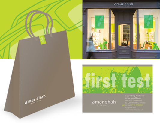
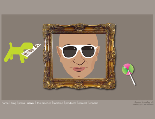
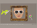
Unique branding for an independent optometrist. The design creates major stand out from the High Street chains resulting in an individual brand full of personality.
We wanted to create an alternative consumer experience rather than going down the classic traditional optician route or the alternative more clinical High Street chain.
Having been inspired by some of the amazing independents in Paris and London, we went for a more chic boutique
look.
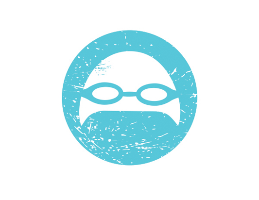
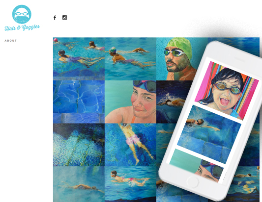
One of my other 'hats' is that of an Artist! I don't just swim at the Lido in Bristol, I paint it too!! Painting is a passion and it's been lovely to link my Design and Art together.
'Hats and Goggles' is the brand I've created for my Lido website. It's used across my social media sites which creates instant recognition for my followers. The Lido community across the UK is getting bigger every year attracting many poets, writers and artists. It's great to have a strong presence in this 'Land of Lidos'
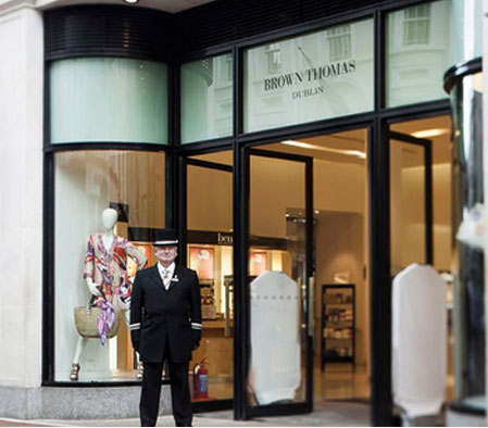
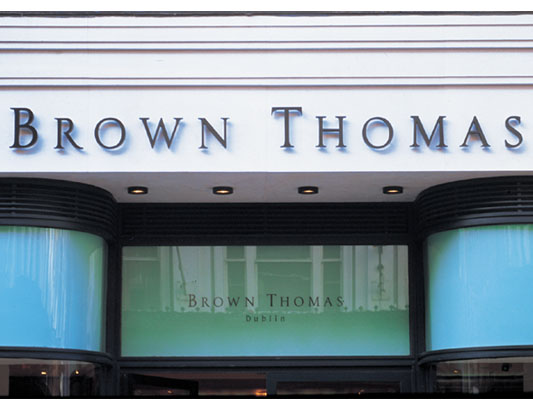
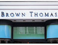
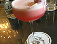
Timeless classic department store elegance. I created the new brand and packaging for Brown Thomas, Dublin.
A great experience in retail design working with a fantastic team of creatives. Architects, Copywriters, Art Directors and Textile designers.
Timeless classic department store elegance. I created the new brand and packaging for Brown Thomas, Dublin.
A great experience in retail design working with a fantastic team of creatives. Architects, Copywriters, Art Directors and Textile designers.
Timeless classic department store elegance. I created the new brand and packaging for Brown Thomas, Dublin.
A great experience in retail design working with a fantastic team of creatives. Architects, Copywriters, Art Directors and Textile designers.
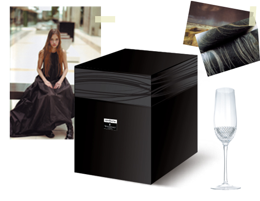
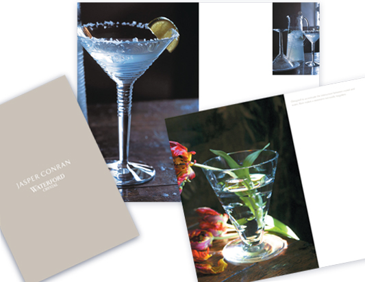
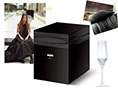
With a decline in interest for cut crystal. Waterford Crystal decided to collaborate
with well known contemporary designers
in order to win back consumer favour.
On a personal level it was a joy to work in collaboration with such eminent figures as John Rocha, Jasper Conran and Lulu Guinness.
(it's OK to name-drop now and again!)
With a decline in interest for cut crystal. Waterford Crystal decided to collaborate
with well known contemporary designers
in order to win back consumer favour.
On a personal level it was a joy to work in collaboration with such eminent figures as John Rocha, Jasper Conran and Lulu Guinness.
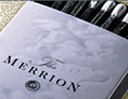
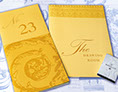
Dublin was at the heart of Georgian society and the city has many fine examples of architecture from this period.
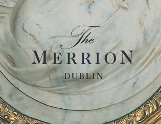
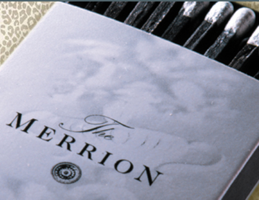
The Merrion is one of the most significant restoration projects which has taken place in Dublin over recent years. A row of four listed houses of historical importance form the main part of this luxurious 5 star hotel. The Merrion is home to an important private collection of 19th- and 20th-century art, to which the hotel’s grand interiors offer the perfect backdrop.
This elegant brand reflects the opulence of Georgian Society and represents the luxury of it's five star rating as one of the leading hotels of the world.
2
Dublin was at the heart of Georgian society and the city has many fine examples of architecture from this period.
The Merrion is one of the most significant restoration projects which has taken place in Dublin over recent years. A row of four listed houses of historical importance form the main part of this luxurious 5 star hotel. The Merrion is home to an important private collection of 19th- and 20th-century art, to which the hotel’s grand interiors offer the perfect backdrop.
This elegant brand reflects the opulence of Georgian Society and represents the luxury of it's five star rating as one of the leading hotels of the world.
The existing symbol of Ireland, (no not Guinness) the Shamrock, was felt to be lacking in personality especially at a time when Ireland, especially Dublin, was becoming the 'go to' destination.
The brief was to create a new 'Brand Ireland' and the aim was to capture the essence of Ireland as an emotional experience for the visitor.
The Irish are famous for their hospitality so the mark represented an embrace which could be interpreted as a warm welcome.
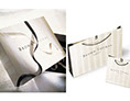
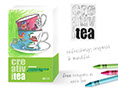
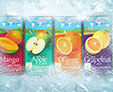
I've worked on so much branded packaging over the years. Here are just a couple of examples. Working with larger companies tends to massively compromise creativity because there are so many people involved in the process. I find you can be more creative with clients who offer more niche products and services.
I work on a one to one basis with my clients which offers both a personable and personal design experience.
I've worked on so much branded packaging over the years. Here are just a couple of examples. Working with larger companies tends to massively compromise creativity because there are so many people involved in the process.
I find you can be more creative with clients who offer more niche products and services.
I work on a one to one basis with my clients which offers both a personable and personal design experience.
I've worked on so much branded packaging over the years. Here are just a couple of examples. Working with larger companies tends to massively compromise creativity because there are so many people involved in the process. I find you can be more creative with clients who offer more niche products and services.
I work on a one to one basis with my clients which offers both a personable and personal design experience.